Prepress for offset printing black-and-white photographs - a primer
The purpose of this article is to document the black-and-white photograph prepress process in Photoshop for offset printing. Hopefully, this will help others who are also looking to learn more about this topic.
First, let’s get some basic definitions out of the way. I self-publish my books as duotone plates printed via offset printing. Offset printing, also known as offset lithography, is a traditional manufacturing process where inked images are transferred from metal plates to rubber stampers, then onto the paper. I use this process because I find that the resulting image reproduction looks much nicer to my eyes than digital printing. The downside is that, typically, offset printing doesn’t allow for small-run book production. Metal plates have to be produced for all pages, so the setup costs are quite high, making small-volume books financially unfeasible.
A duotone image plate in offset book printing allows for a photograph to be printed using two distinct ink plates, a black ink and one spot color. Just like sepia or selenium toning a black and white gelatin silver print, adding an additional color ink to the black and white photo allows for enhanced tonal range, contrast, and overall depth. Since I lightly sepia-tone my darkroom prints, it makes sense for me to use the duotone process for my books, since it more closely replicates the look of my prints.
Here’s an important concept - standard dot limits. In offset printing, standard dot limits refer to the expansion of halftone dots (dot gain) from the original digital file to the final printed page. This phenomenon is a natural result of the lithographic process, where pressure and ink absorption on the page cause dots to enlarge, making the printed image appear darker than intended.
Simply put, with the offset printing process, the printed images on the page will print darker than they appear digitally on a calibrated computer screen. Therefore, some adjustments need to be made at the prepress stage to adjust for this phenomenon.
Now, if you are a self-publishing photographer like me, you will go out and find a printer to offset-print your book. But, depending on which printer you decide to use, they will have different requirements for how you need to prepare your files. Some printers will do almost all of the prepress work for you, and some will ask you to do some of the prepress work. My findings so far is that the prepress work that we - the customer - might be asked to do, can be broken down into the following steps:
Selecting the second duotone color.
Creating a curve to compensate for Minimum Dot (Highlight) and Maximum Dot (Shadow).
Creating a 15% dot gain curve to reduce midtone density for the black ink channel. This is done to compensate for the ink spreading (dot gain) that occurs when paper absorbs ink.
Creating the 15% dot gain curve for the second color ink channel. From my very limited experience (having only worked with two different printers), the print technicians will usually create and apply this second channel curve for you. Therefore, this step is not covered in this article.
Let’s take a look at my findings for each of these processes.
Selecting the second color
This step is relatively straightforward. You find a print that has the gray midtone tonality you want to use for the book, and you either provide the print to the printer to match the closest Pantone color to the tone of the print, or you match it yourself. The image below shows this process.
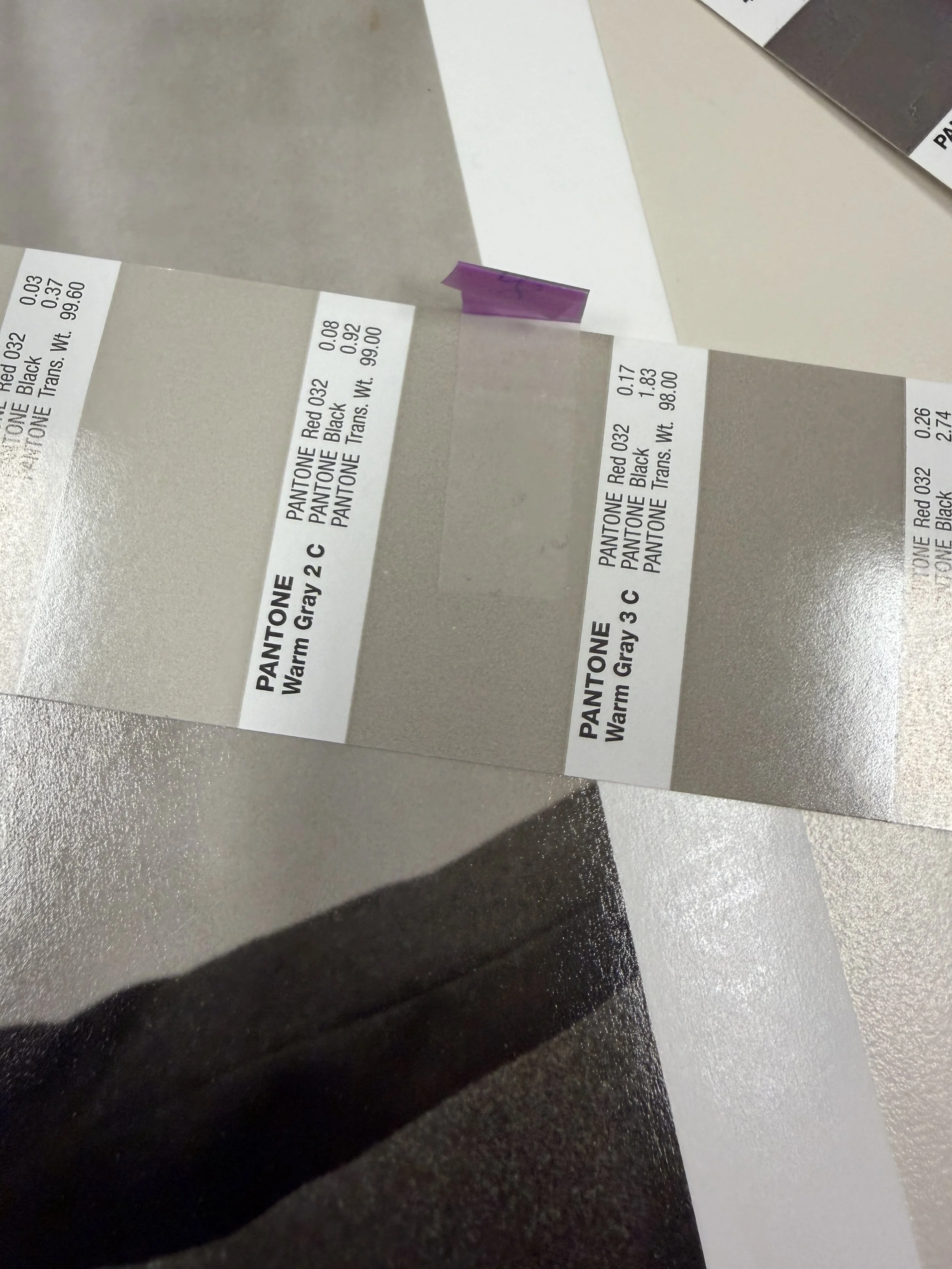
The print sits below the Pantone color bridge guide. In this case, we decided that Pantone Warm Gray 3C was a close, if not perfect match.
Creating a curve to compensate for Minimum Dot (Highlight) and Maximum Dot (Shadow)
For my first offset-printed book, Marine Layer, I worked with a printer that only required me to create this minimum and maximum dot compensation curve. They did all the rest of the prepress work. In commercial offset printing, standard dot limits typically fall around 3% for highlights and 95–98% for shadows, though these values shift depending on paper stock and the type of press used. Coated Paper usually supports a wider range, from 2% up to 98%. The smooth surface allows for finer detail without the dots bleeding together or disappearing. Uncoated Paper has a more limited range, generally limited to 5% to 90%. Because the paper is absorbent, small highlight dots may fail to transfer, while dark shadow dots expand (dot gain) and "plug" more easily. The printer should be able to provide specific instructions based on your choice of paper. Here are the steps for creating this curve in Photoshop.
First, make sure the image is set to 8-bits/channel grayscale (these two settings are found under “Image” -> “Mode”)
Resize the image down to its correct size in the book (“Image” -> “Image Size”)
Now to create the curve. “Image” -> “Adjustments” -> “Curves”
You will see a “Curves” window like this:
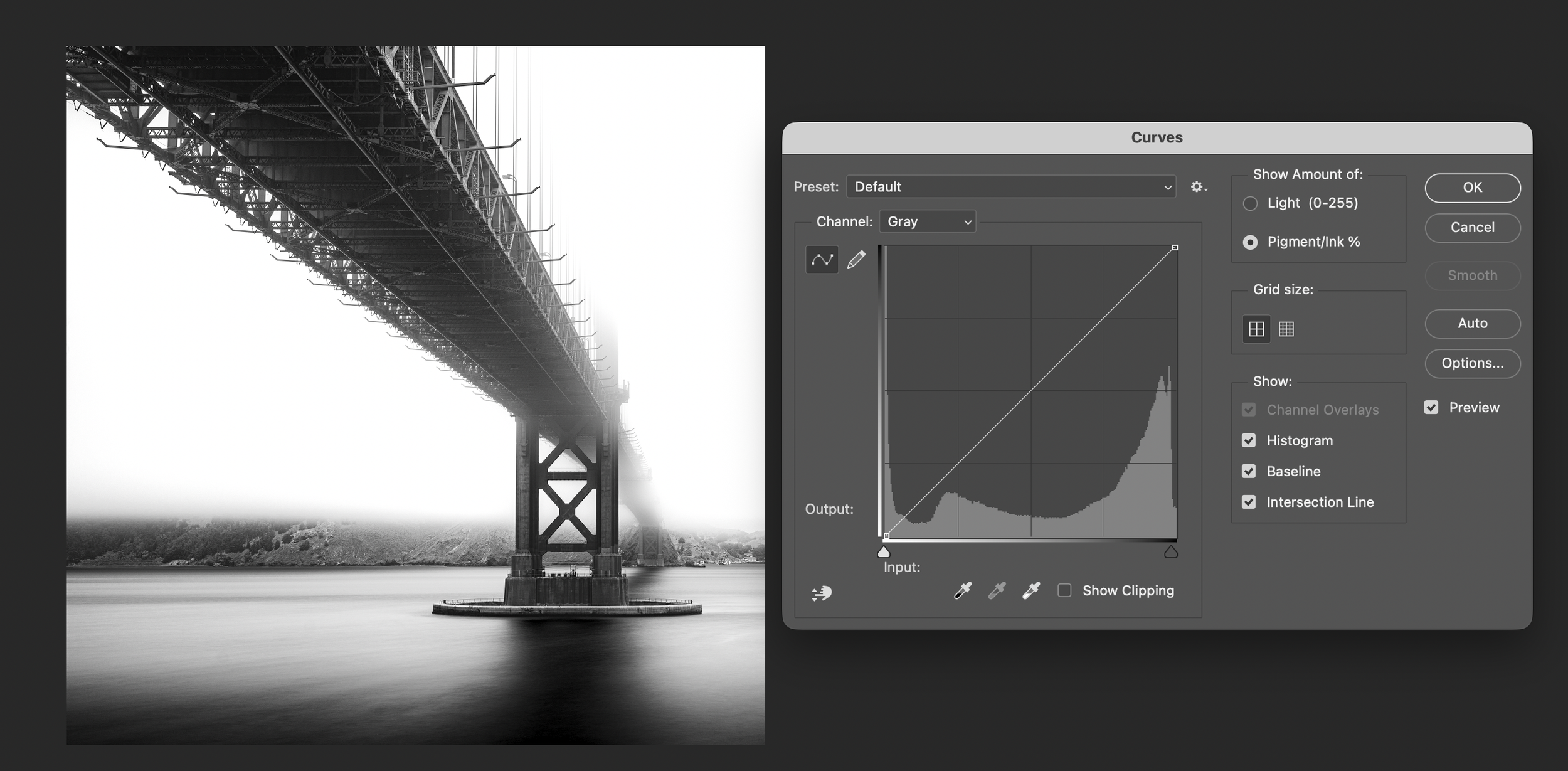
Again, your printer will give you specific settings for both the highlight and the shadow compensation curves. For Marine Layer, I was told to create a 5% cut of highlights and a 2% cut (so, 98% remains) of shadows.
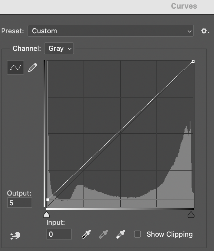
To apply the highlight cut, place your mouse cursor at the bottom left side of the curve, and drag the “output” setting up from 0 to 5, as seen in this screenshot:
Next, to apply the shadows cut, place your mouse cursor at the top right side of the curve, and drag the “output” setting up from 100 to 98, as seen in this screenshot:

Click on “OK”, and you are done. If you need to apply this curve to all of your book images, it is a good idea to save the curve as a preset (click on the Wheel icon next to the preset selector, and select “Save Preset”.)
Not much will change in the way the image looks on the screen after the curve is applied. Blacks will look a little bit “washed out” and not quite as deep black as before. Same with whites, they won’t be quite as bright. This is what we want; we’ve made “room” in the file to counteract the physical limitations of the printing press and paper. This will ensure that the printed photo will retain details, accurate tonal gradation, and desired contrast. Without this adjustment, the images would look "muddy" in print. The curve ensures we have no "scumming" (ink where it shouldn't be) and no "plugging" (loss of shadow detail).
Creating a 15% dot gain curve
As previously stated, the purpose of this curve is to reduce midtone density for the black ink channel to compensate for the ink spreading (dot gain) that occurs when paper absorbs ink. Here are the steps for creating this curve in Photoshop.
First, make sure the image is set to 8-bits/channel grayscale (these two settings are found under “Image” -> “Mode”)
Resize the image down to its correct size in the book (“Image” -> “Image Size”)
Now to create the curve. “Image” -> “Adjustments” -> “Curves”
You will see a “Curves” window.
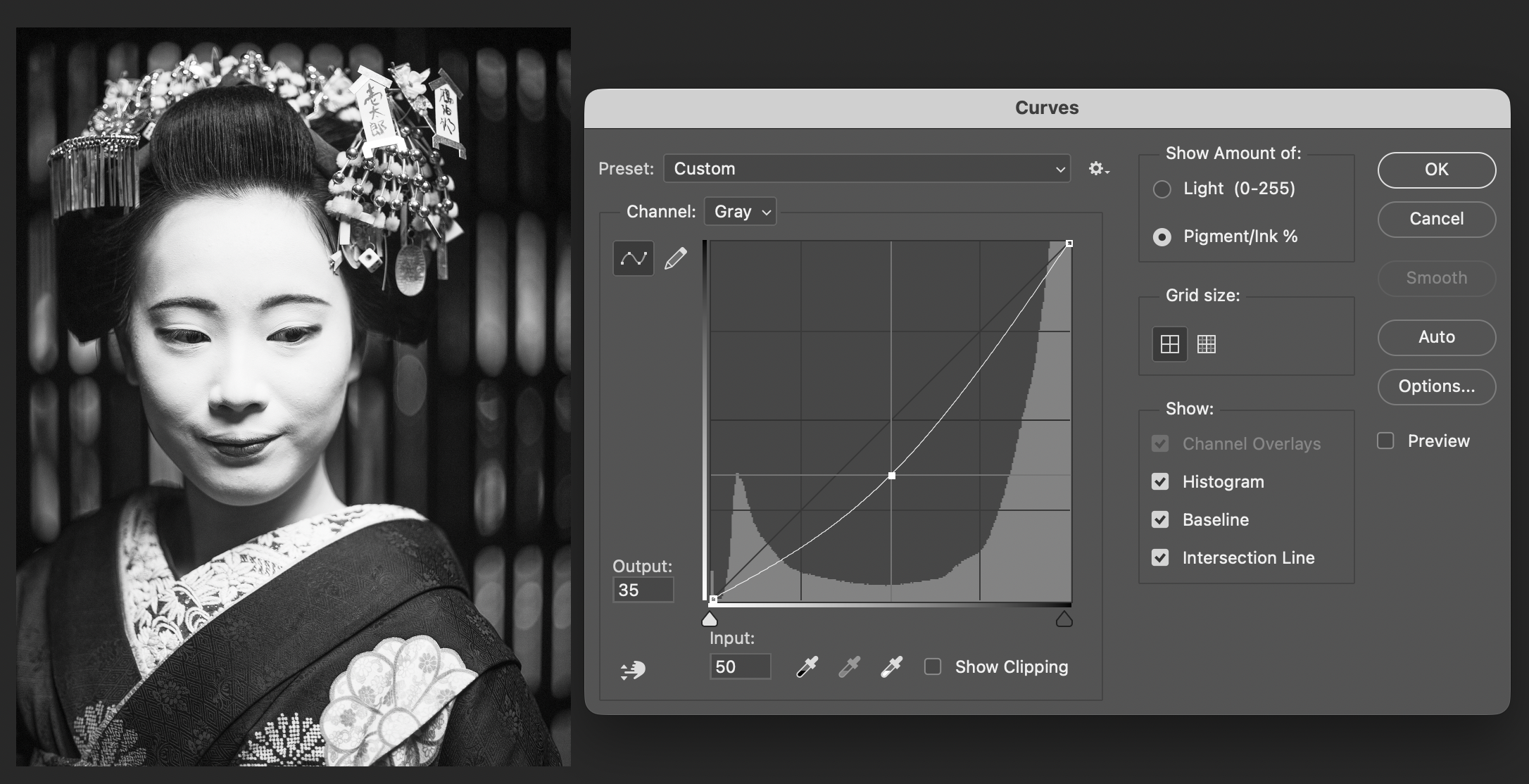
To apply the 15% dot gain curve, place your mouse cursor at the center of the curve, and drag the “output” setting down from 50 to 35 (a 15% cut, hence the name) as seen in the screenshot below. The “input” should show “50”, and output should show “35”.
Click on “OK”, and you are done. If you need to apply this curve to all of your book images, it is a good idea to save the curve as a preset (click on the Wheel icon next to the preset selector, and select “Save Preset”.) Also, note that if you need to apply the Minimum Dot (Highlight), Maximum Dot (Shadow), and 15% dot gain curve to all images, they can all be applied at the same time, and saved as a single preset.
Here is what a photograph looks like before and after the curve is applied:
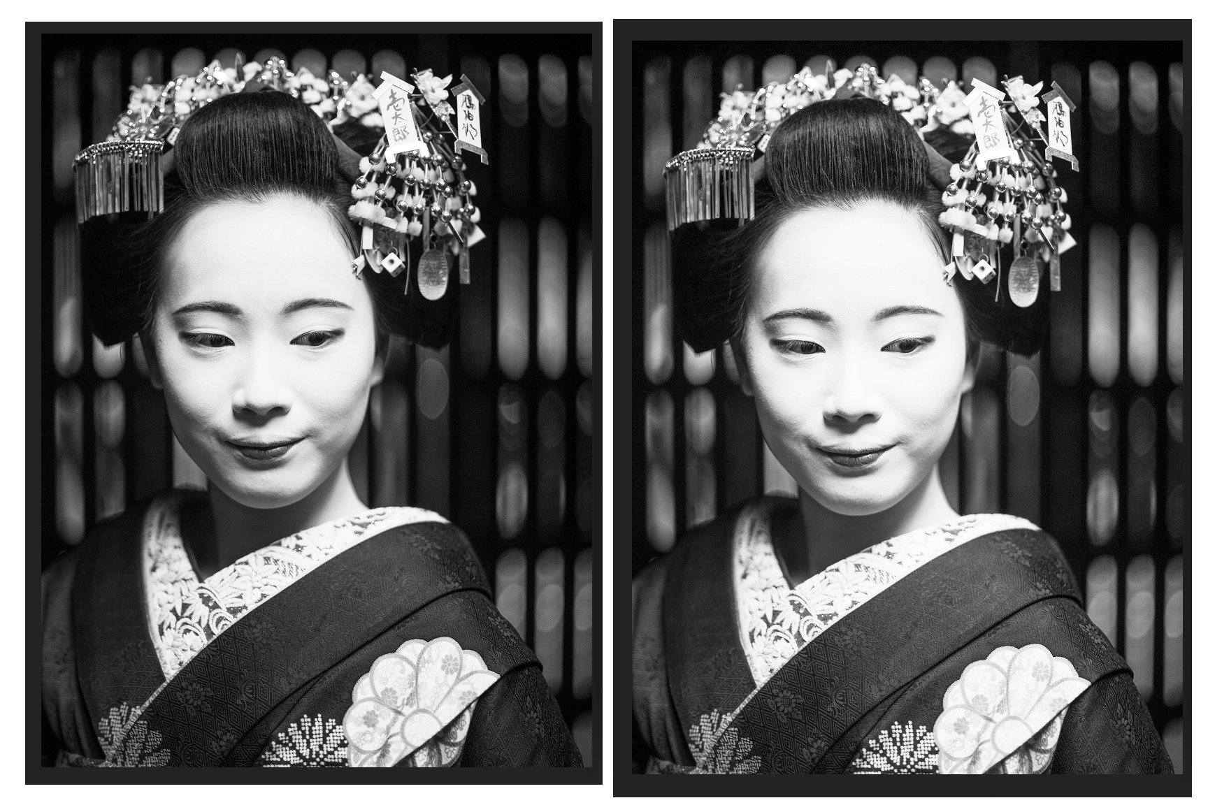
On the left: image before the 15% dot gain curve is applied, on the right: image after the curve is applied.
As you can see, the image on the screen looks quite different after applying this curve. The highlights and midtones look a bit too bright. It is normal for a 15% dot gain compensation curve (often called a pull-back or lightening curve) to make a grayscale image look too bright, washed out, or high-contrast on a computer monitor. The purpose of this adjustment is not to make the image look good on screen, but to ensure it looks correct after it is printed, as ink spreads (dot gain) on paper, making the final output much darker than the screen version. The "15% Dot Gain" profile or curve simulates a 15% expansion of halftone dots on paper. By applying this in Photoshop, we are manually lightening the midtones and shadows to counteract this future darkness.
It is important to keep in mind that 15% is a somewhat arbitrary number that is used as a safe “default setting” to compensate for the ink spread on the paper. But, different papers absorb ink differently, and might require different dot gain adjustment percentages. Glossy, coated papers have lower dot gain because the surface is hard and smooth, reducing absorption. The ink sits on top, yielding sharper dots, which requires less reduction in dot size during prepress. Matte/uncoated papers have a rougher, more porous surface that causes ink to spread more upon absorption. This "higher dot gain" requires a more aggressive compensation curve in prepress to reduce the dot sizes so they do not merge and create overly dark, murky images. Some matte/uncoated papers might require up to a 20% curve. Your printer should be able to provide guidance on the dot gain compensation percentage needed for your chosen paper stock.
I hope that this information is of any value to you. If you have any expertise in prepress for offset printing and have found any errors, omissions, or would like to comment, please feel free to contact me. I will update this text as I continue to learn more about this process.